

 My Comments: To say I’m uncertain what tomorrow will bring is an understatement. For every article like this one that is pessimistic, there is another with presumably compelling logic that the next market crash of consequence will not be here until 2030 or later.
At my age, I’m inclined to be cautious. Yes, I have some money exposed to the markets, but I’ve got Vanguard on speed dial. My memories about this go back to Black Monday in 1987 when people were jumping off buildings.
This is a long read with lots of charts so I’ve tried to whet your appetite and provided a link to the site where it’s posted originally. Have fun…
Jul. 30, 2018 | Jesse Columbo
In Part 1 of this series called “Why U.S. Household Wealth Is In A Bubble,” I explained why America’s post-Great Recession wealth boom is driven by a tremendous bubble that will end in tears.
In Part 2 of this series, I will go into more detail about the U.S. stock market bubble that is a major driver of the overall household wealth bubble. Common stocks – including those held indirectly in mutual funds – are one of the largest components of U.S. household wealth, along with bonds and housing. When stocks are extremely inflated, like they were during the late-1990s Dot-com bubble, they contribute to the inflation of household wealth. Conversely, when stocks experience a bear market, like they did when the Dot-com bubble popped, household wealth falls as well. In this piece, I will show a wide variety of charts and other data that prove beyond a reasonable doubt that the U.S. stock market is excessively inflated and heading for serious pain.
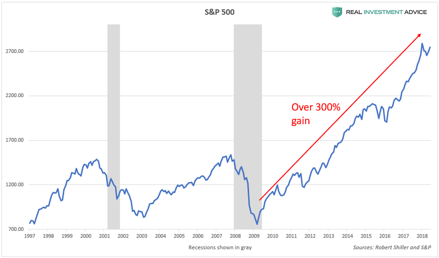
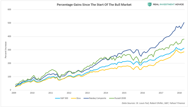
Since the Great Recession bear market bottom in March 2009, the bellwether S&P 500 stock index is up a jaw-dropping 300 percent. In addition, the index is approximately 80 percent higher than its 2007 peak.
The more volatile Russell 2000 small cap index and the tech-centric Nasdaq Composite Index are up even more than the S&P 500 – approximately 400 percent and 500 percent respectively:
As discussed in Part 1 of this series, record low interest rates are the primary reason for both the overall U.S. household wealth bubble as well as the U.S. stock market bubble. The chart below shows how U.S. interest rates (the Fed Funds Rate, 10-Year Treasury yields, and Aaa corporate bond yields) have been at record low levels for a record period of time since the 2008 financial crisis. The fact that credit has been so cheap for so long explains why the household wealth bubble is so extreme and why the stock market bubble is so inflated, as valuation indicators later on in this piece will show.
Low interest rates contribute to the inflation of asset and credit bubbles in numerous ways:
• Investors can borrow cheaply to speculate in assets (ex: cheap mortgages for property speculation and low margin costs for trading stocks)
• By discouraging the holding of cash in the bank versus speculating in riskier asset markets
• By encouraging higher rates of inflation, which helps to support assets like stocks and real estate
• By encouraging more borrowing by consumers, businesses, and governments
The chart of real (inflation-adjusted) interest rates below confirms just how loose U.S. monetary policy has been since the Great Recession. In recent decades, the only time the U.S. has experienced negative real interest rates for a significant amount of time was during the mid-2000s housing bubble and during the current “Everything Bubble” period that started after 2009. (Note: “Everything Bubble” is a term that I’ve coined to describe a dangerous bubble that has been inflating across the globe in a wide variety of countries, industries, and assets – please visit my website to learn more.)
Another way of determining how excessively loose (or tight) U.S. monetary conditions are is by comparing the Fed Funds Rate to the Taylor Rule model. The Taylor Rule is a proposed guideline created by economist John Taylor to estimate the ideal level for central bank-controlled benchmark interest rates – such as the Fed Funds Rate – for the purpose of maximizing the stability of economic growth. When the Fed Funds Rate is much lower than the Taylor Rule model, it means that interest rates are likely too low relative to economic growth and inflation, which greatly increases the probability of forming a dangerous economic bubble. The chart below shows that the Fed Funds Rate was much lower than the Taylor Rule model during the formation of both the mid-2000s housing bubble as well as the current “Everything Bubble.”
To see all 14 pages of this article and the many charts, go HERE…
