

My Comments: Are we going to experience a market crash? Most certainly, at some point in the future. How far into the future is, in my opinion, an educated guess. These words from Man Yin To are to my mind, a very educated guess. What you do with them is up to you.
by Man Yin To \ 8 APR 2021 \ https://tinyurl.com/yjz5cwac
Summary
- Minsky identified 5 stages in a typical bubble – displacement, boom, euphoria, profit-taking, and panic.
- It is the euphoria stage that is most important in predicting when a bubble is about to pop.
- Based on historical bubbles, a descriptive method has been invented to identify when a bubble is in the making.
- Linear regression on the most recent 18-month DJIA closes is used to measure the intensity of the euphoria. When compared with historical norms, investors are in a better position to realize the market risk.
Introduction
In a financial context, the term ‘bubble’ generally refers to a situation where the price of an entire market exceeds its fundamental value by a large margin. The concerned market index rises rapidly at an unprecedented pace, growing far beyond its previous level in a short period.
It is at this instant that ordinary citizens, mostly amateur investors, are agitated and join in the party. Profits come in so easily that attract even more participants to jump in. Occasionally, the market may correct, but all the time without exception, the index can always come back and making higher highs.
Hot stocks are crazily chased without regard to their unreasonably high PE. Gurus begin to appear and warn the public that the market may not sustain. Yet every whittle blower turns out to be erroneous in his prediction. All bears that dare to challenge the trend are slaughtered and the bull proudly proceeds on.
With the more new money coming in, the steam goes on. The market has ascended into euphoria. People are quitting their paid jobs to devote most of their time to the market. It appears that pursuing a paid job looks foolish as money can be earned from the market so effortlessly. Losers are nowhere to be seen. All bull followers in the market are winners. Those who are bold enough to invest on margin yield even more. The market has become the fastest generator for producing millionaires.
Bad economic news may sometimes crop up. The market simply does not listen. It just rises and rises. If the stock market is a zero-sum game, where are the losers? History has proved repeatedly all market bubbles are destined to crash, only no one knows when. Bubbles are programmed to land someday, just as jet planes cannot fly eternally in the sky.
Valuation metrics are touted to justify the relentless rise in asset prices. As valuation reaches extreme values, the smart money is escaping. At market peaks, big funds are amongst the first to sell their positions. It would not be long when panic set in. Gravity finally has the upper hand. A crash thus occurs.
Below I will give a brief account of some notorious market bubbles that occurred in the past. Then I will postulate how I attempt to measure their intensity to predicting when a bubble is going to meet its reckoning date.
The 1929 Great Depression
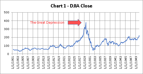
The Great Depression was a severe worldwide economic depression that took place mostly during the 1930s, beginning in the US. The timing of the Great Depression varied across the world; in most countries, it started in 1929 and lasted until the late 1930s. It was the longest, deepest, and most widespread depression of the 20th century.
The year was 1918. US had emerged as one of the victors in World War I. The economy was coming back as delayed projects were springing up again. People were pouring their life savings into hot stocks in the hope of making good money. By 1925, the DJIA index broke out from its 8-year long sideways drift and sparked a euphoria. In the next 4 years, DJIA had reached a level nearly 4 times it had started.
Then in October 1929, DJIA started to plunge, and in one month the index had lost 13% of its value. As people began to sell in massive quantities the stock market crashed so much so that certain stocks could not be sold at any price. By June 1932, DJIA had evaporated 88% of its peak value, down to a mere 43 points.
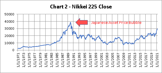
The Japanese Asset Price Bubble
(Source of data: stooq.com)
The Japanese asset price bubble was an economic bubble in Japan from 1986 to 1991 in which real estate and stock market prices were greatly inflated. In early 1992, this price bubble burst, and Japan’s economy stagnated. The bubble was caused by the rapid growth of asset prices, overheated economic activity, and uncontrollable credit expansion.
The Nikkei 225 index rose more than 9 times in the 15 years before it finally topped. Trying to deflate speculation and keep inflation in check, the Bank of Japan sharply raised inter-bank lending rates in late 1989. This sharp policy caused the bursting of the bubble, and the Japanese stock market crashed. Only until 2013 did the Nikkei 225 index cease in its decline.
The deflationary process of the Nikkei Index was extremely long. It took the index some 20 years from a peak of 38916 down to a bottom of 8109, which represents a loss of 79% of its peak value.
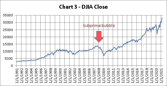
The Subprime Mortgage Bubble
(Source of data: stooq.com)
The financial crisis of 2008 is considered the worst economic crisis since the Great Depression. It is difficult to define the exact causes of the crisis, but the collapse of the US housing market was one of the greatest factors. It started a chain reaction that led to the bankruptcy of the Lehman Brothers and soon a crippling effect on the economy at large.
In the early 2000s, interest rates were so low that many Americans borrowed money to buy houses causing house prices to increase rapidly. This episode is known as the US housing bubble and lasted until early 2006 when house prices peaked. The burst of that bubble led to the tumble of the subprime mortgage market and snowballed into a global collapse.
The US experienced a sharp recession, causing 8 million citizens to lose their job and 4 million homes foreclosed. The unemployment rate in the US reached some 10%. The stock market suffered a squeeze that plunged 45% from its peak.
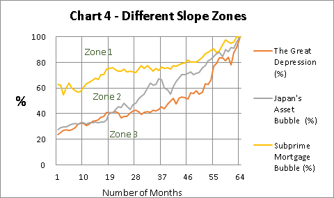
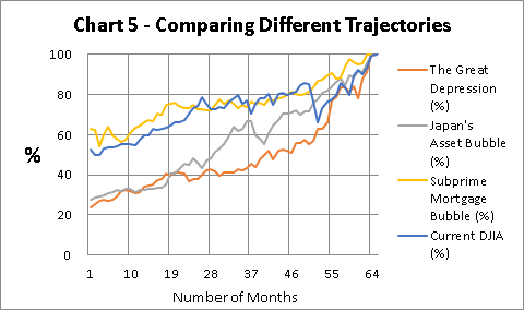
When Will A Bubble Peak?
(Source of data: Author via Excel Spreadsheet)
Chart 4 is an alternative presentation of the three historical bubbles in a single chart. As they occurred in different periods, I adopt percentages on the Y-axis and fixed 100% as the ceiling of the metric. For each bubble, I look back 65 months before the relevant peaks are created.
Here from month 1 to month 65, the left side of the mountain has been formed. The right side is simply a copy of these curves symmetric about the vertical axis. That will be the best scenario. In fact, after crossing the peak, the plunge can be very abrupt and devastating.
This presentation has another merit. It helps investors to predict the depth that the whole dive can reach. The relevant figures come from month 1 of Chart 4, the start points of the trajectories.
| Name of Bubble | Predicted Dive | Actual Dive |
| The Great Depression | 77% | 88% |
| Japan’s Asset Bubble | 73% | 79% |
| Subprime Mortgage Bubble | 38% | 45% |
Is the present-day DJIA a bubble? This problem can be answered by plotting a chart similar to the one above. Thus Chart 5 depicts the trajectory of DJIA for the past 65 months. Here, DJIA at 33153 is taken as 100%. It can be safely asserted that the present-day DJIA behaves very similar to that of 2008.
A bubble is in the making, but as of now, it is in the order of the subprime mortgage bubble type. It is located on the boundary of zone 1 and zone 2. Given enough time, it may evolve into zone 2, where the bursting power is a lot greater.
(Source of data: Author via Excel Spreadsheet)
Conclusion
The most important concept I wish to bring out in this article is I choose to look back in time instead of the conventional way of looking forward to the future. The arrow of time is always advancing. This leads us to think within the box that in turn may hamper us from discovering useful metrics in tackling complex problems.
It is time to describe the new indicator I devise to quantify the intensity of the market. It is the 18-month slope of the most updated DJIA index. The concept comes from linear regression, which is particularly useful for time-series data.
You may notice that all 65-month trajectories are curves rather than straight lines. They bear the similarity that they all concave upward. This is a very useful property as it safeguards the largest slope is to appear in the most recent readings. We shall never know when a crash will arrive. But we have historical norms for reference. Once the slope of DJIA is updated, we know if the current state is safe or risky.
| Name of Bubble | Bursting Power | 18-month Slope |
| The Great Depression | Devastating | 2.5285 |
| Japan’s Asset Bubble | Fierce | 1.6066 |
| Subprime Mortgage Bubble | Strong | 1.2329 |
| Current DJIA | Becoming | 1.1431 |
The figure 1.1431 is amazing. If it does not qualify the market as being in a bubble, the current DJIA is already at the door of one. At least, it signifies the market is overheated, though a bit less vibrant than that of the 2008 subprime mortgage bubble. Even though a crash is not coming, a close monitor of the market is still necessary. Investors should be alert of any disproportional surge and may need to properly hedge their positions as a safety measure. Lastly, interested readers can download from me the relevant Excel file CMB.xlsx if they want to know more about it.
